This plugin will be especially useful for product designers. Try using it for components and component sets in your design system—it helps you organize them in a clear, logical way and build matrices of possible variations. It’s called Component Grid Builder. I’ll go into more detail about how to use it at the end.
But first, I’d like to talk about the process of building it. Who hasn’t been talking about vibe coding lately? The word of the year!
Vibe coding
This is my first Figma plugin, and I wouldn’t have been able to build it without Claude’s help. Yes, at times it wasn’t easy: you can’t really build something like this using pure vibe coding and chat prompts alone (at least not yet), and at some point I had to dive into the code myself and help Claude fix errors.
It all started something like this:
— Dude, I’ve got an idea! Let’s build a plugin. Here are the minimum requirements for what it should do: …
In response, I got three code files and a solid set of instructions on how to feed them into Figma to make everything work. The first iterations were pretty straightforward. I’d ask for changes, Claude would rewrite the code, and I’d copy and replace the files. If an error came up, I’d copy it and show it to Claude, he’d rewrite the code again, I’d copy it again…
But at some point, I hit a wall: no matter how many times Claude rewrote the plugin in response to the console errors I sent him, nothing really improved. Claude knows JavaScript well, but Figma’s API—not so much.
So I had to take one of the last working versions and change my approach. I dug into the code he had generated and started making more precise requests for specific functions, checking their availability in the Figma API along the way. From there, I began consciously modifying the code myself and testing the plugin after each meaningful change. Sometimes Claude helped me understand what was going on in the code; other times I had to guide him toward simpler, more efficient solutions. But most importantly—we made it work together!
Modern large language models are, genuinely, a very powerful and practical tool. They significantly lower the barrier to entry into almost any field and make it much easier to learn things quickly. If you haven’t tried them yet, I highly recommend it.
The best part is that you can ask them any kind of “stupid” question and get an instant answer. Yes, they make mistakes, and you should double-check everything they tell you—but in many cases, verifying is much easier (and more enjoyable) than building something from scratch yourself.
Just keep in mind that, at their core, these models are designed to generate probabilistic outputs—data that looks very much like the truth, but isn’t guaranteed to be it ;)
About the plugin
I’ve already written about the plugin on LinkedIn—here’s the link, check out the video. Right now, I’m working on a new release that will allow you to customize the position of labels (I don’t always like them sticking out on the left and top).
How to use it
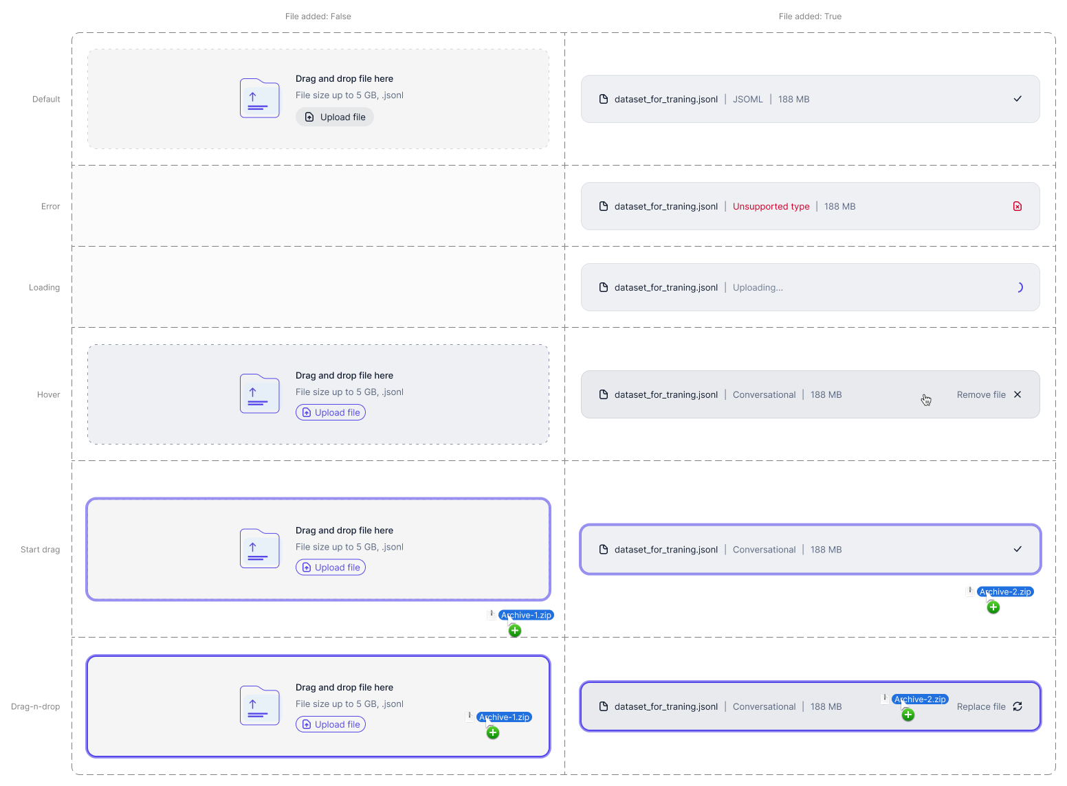
The most basic use case is to neatly label the variants of a component set, making it easier to work with and quickly understand what a component can do and which variant needs to be edited. Yes, there are plugins that do something similar, but they either don’t look very good or aren’t flexible enough.
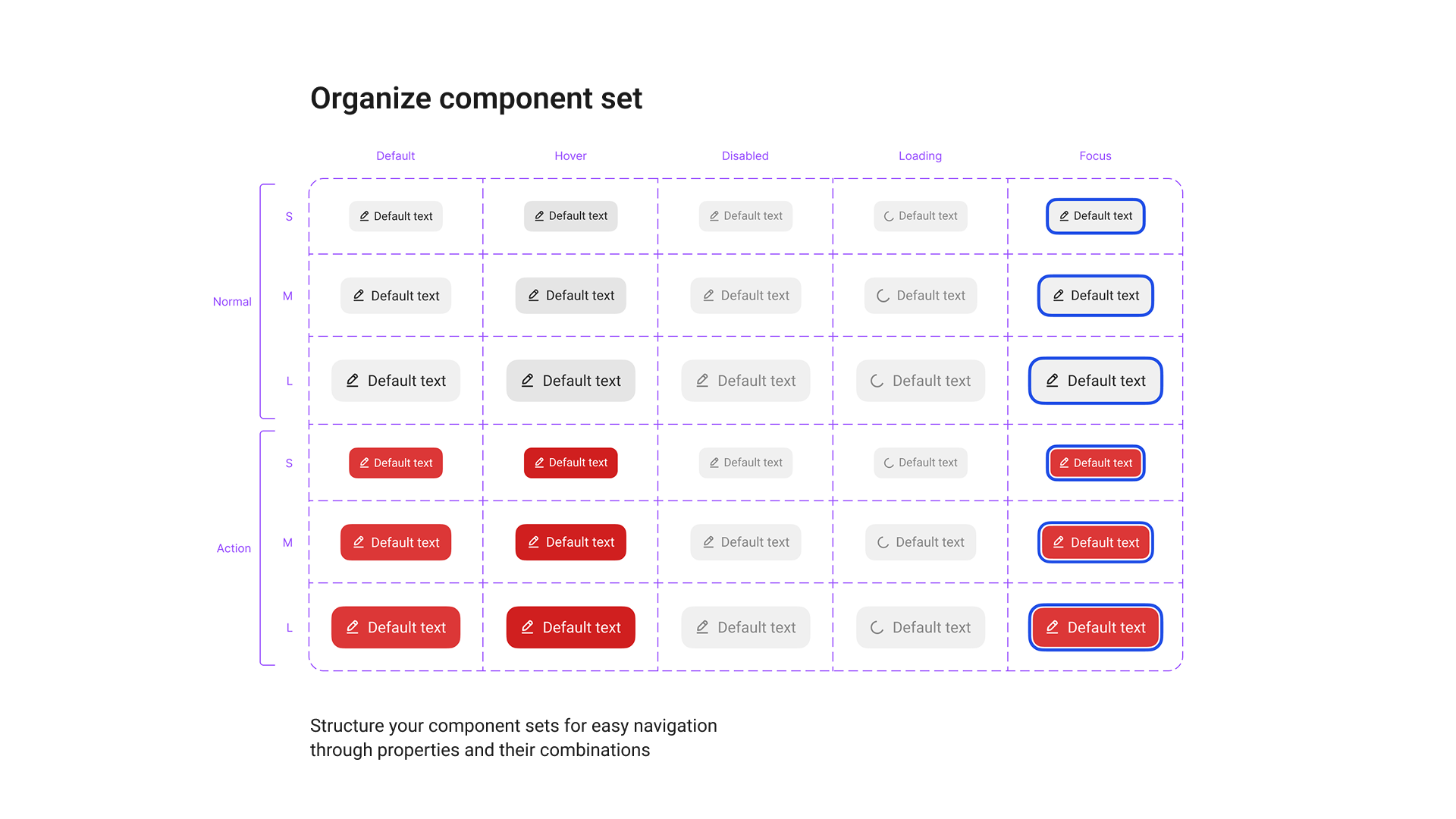
Beyond organizing component sets, you can also take any instance, configure it the way you like—change the text, enable all hidden layers (Boolean properties)—and then, with a single click of the plugin, generate a matrix of possible variations. This lets you clearly see how the instance behaves under different combinations of properties.
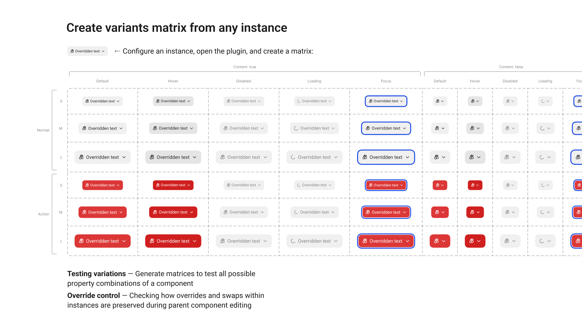
Why is this useful? So that when you’re editing a component, you don’t forget about hidden layers that affect it in certain states. They should look consistent and not break the component instance when turned on. In my experience working with components, this happens all the time—for example, you update the color of a visible icon but forget about the hidden ones.
On top of that, these matrices make it easier to track how changes to a parent component affect the behavior of its instances. So that designers using your components don’t come after you after a library update—and you don’t have to roll back your latest pushes—you can at least visually review these matrices while editing.
You can even take it a step further and do something similar to screenshot testing: keep these matrices with all possible variants in a separate test file, overlay a reference screenshot with a Difference blend mode, and any visual changes after an update will immediately stand out.
And one more useful application—you can create clean, well-structured documentation for development. Place a neatly arranged set of component states alongside your page layouts and main flows, so developers can understand things faster and implement your ideas more accurately.
That’s about it. Thanks for your attention—give the plugin a try and share it with your friends. The number of users and your likes really help me keep improving and developing it!